
Magenta and Momentum: Rebranding a Women’s Fitness Coach with Purpose
“I want my logo and brand to feel welcoming, not a scary place where women are worried about what’s ahead!”
BUSINESS NEEDS
Beyond Fitness (formerly The Well Woman Coach) knew that their branding was weak but they weren’t sure where to start in order to ensure that their services weren’t being under appreciated.
After our initial chat we decided that an entire overhaul was required - name, logo, identity, tone of voice, key messaging talking points - everything! With one exception: the founder Shelly wanted to maintain the colour.
Since the magenta colour was as strong, vibrant and energetic as the woman behind the business, I agreed that it should definitely be maintained.
DELIVERABLES
Name Generation
Concept Development
Primary Logo Design
Secondary Logo Designs
Logo Symbol
Logo Word Mark
Brand Style Guide
Website Design and Development (Squarespace)


PROJECT RESULTS
From the very initial brainstorming session together, Shelly and I felt the language and direction of the business should be more focussed on the client and their needs and goals, as opposed to Shelly’s background and experience. Without undermining Shelly’s experience both personal and professional.
At a glance anyone can tell how passionate Shelly is so it felt like the right time to change the conversations to the set backs, fears and goals of her potential and current clients.
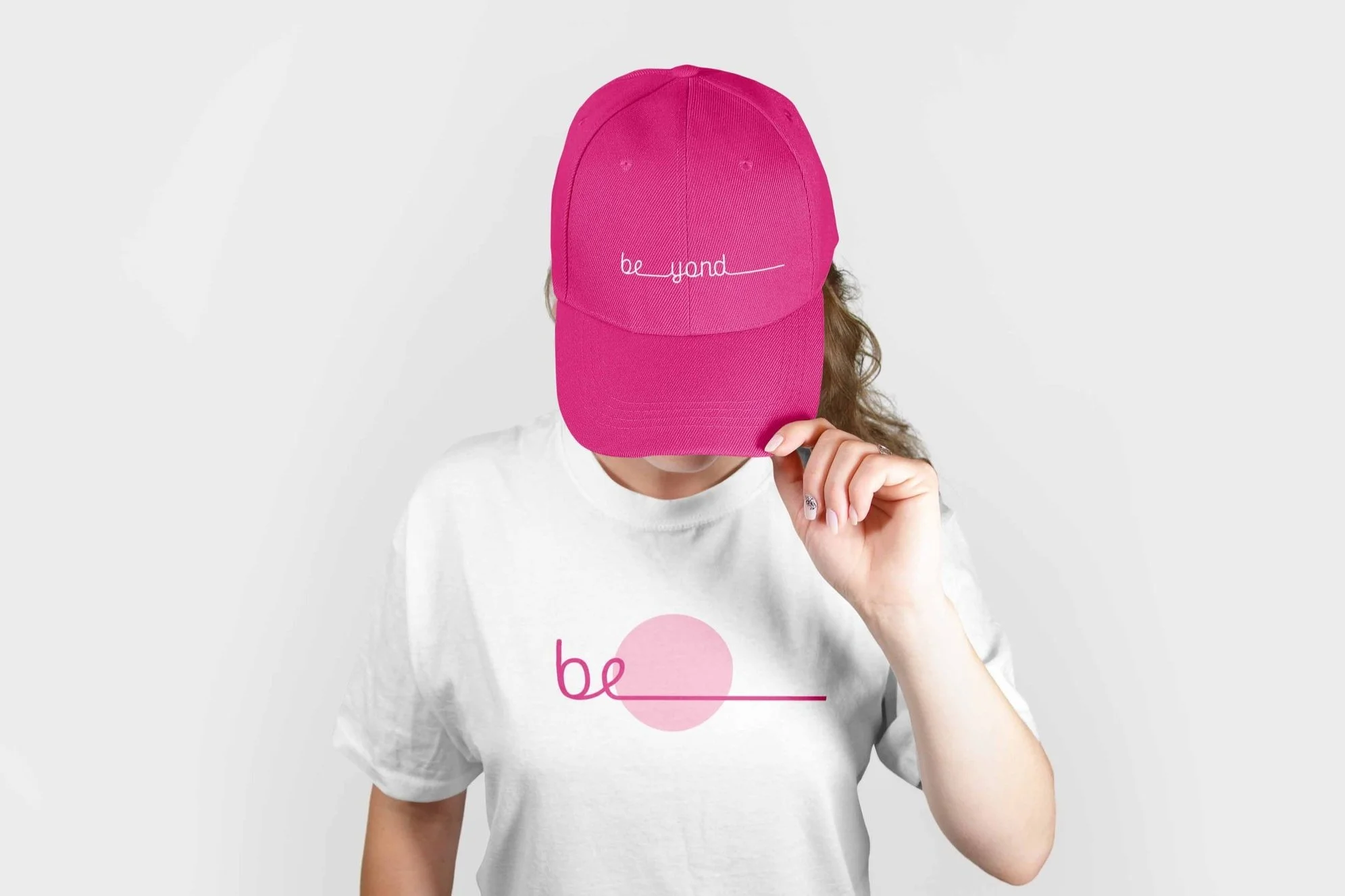
‘Beyond’ was chosen to reflect that the business offers more than exercise, but also nutrition, support and a caring community.
The logo symbol bird symbolises a new beginning filled with hope, and freedom. Some bird species can also symbolise traits such as strength, and courage. The origami style (utilising triangles) also reflects the 3 core structures within the business and it’s messaging (‘exercise, mindset, nutrition’ and ‘restore, rebuild, reignite’). Origami strengthens your brain and helps with stress relief, similar to the benefits of exercise and in particular pilates and getting fresh air all within the business brand values. And finally, the circle represents core, community and security.
The word mark celebrates pacing yourself and working to your own progress. The ‘be’ is also separated to allow the brand to grow with the business and as a marketing tool for campaigns and promotions e.g. be_yourself, be_strong etc.
WHAT THE CLIENT SAID
“Working with Lorraine was such an amazing experience! I went to Lorraine as I wanted to do a brand overhaul for my business, including new logo, branding as well a new business name.
The task itself felt so daunting but reaching out to Lorraine she made me feel so at ease about the process, what it would entail and at no stage did I feel any pressure from Lorraine (which made me want to work with her even more!)
Lorraine not only listened to me but she also heard the underlying messages I was trying to convey! She took such an active interest in what was at the heart of my business and the ideas and designs she came back to me with blew me away. The logos she created were stunning and branding guide she provided me with at the end of working together have been invaluable!
When it came to creating my website a few months later, there was no question that I would use Lorraine and her services again. Lorraine has an incredible way of turning your thoughts in to something beyond your own imagination!
I couldn't recommend Luuuby Creative enough - for her creativity, attention to detail, professionalism and her ability to put you at ease through it all!”
Feeling stuck with your branding? Let’s get you moving.
Supportive
We guide you through the design process. We like to encourage honest conversations around your business goals and current struggles in order to help find solutions to grow your business brand.