
Case Study: A Smart, Flexible Brand Identity for Harley Heating
“We wanted a logo that helped identify the business through the use of colour.”
BUSINESS NEEDS
As a new business in a saturated industry Harley Heating knew that they needed to stand out to be taken seriously and a copy-and-paste logo wasn’t going to help them stand out against their competitors.
The project had a unique challenge in that the colours needed to look equally great on a white background as they would on a dark grey background due to the work vehicle already being purchased in dark grey.
DELIVERABLES
Research and Concept Development
Primary Logo Design
Secondary Logo Designs
Logo Symbol
Logo Word Mark
Logo Family Production (cmyk, rgb, white, black in various formats e.g. .ai, .png etc)
Brand Style Guide
Additional Logo Versions
Business Card Design
Pattern Design
Van Signage Design
Website Assistance


PROJECT RESULTS
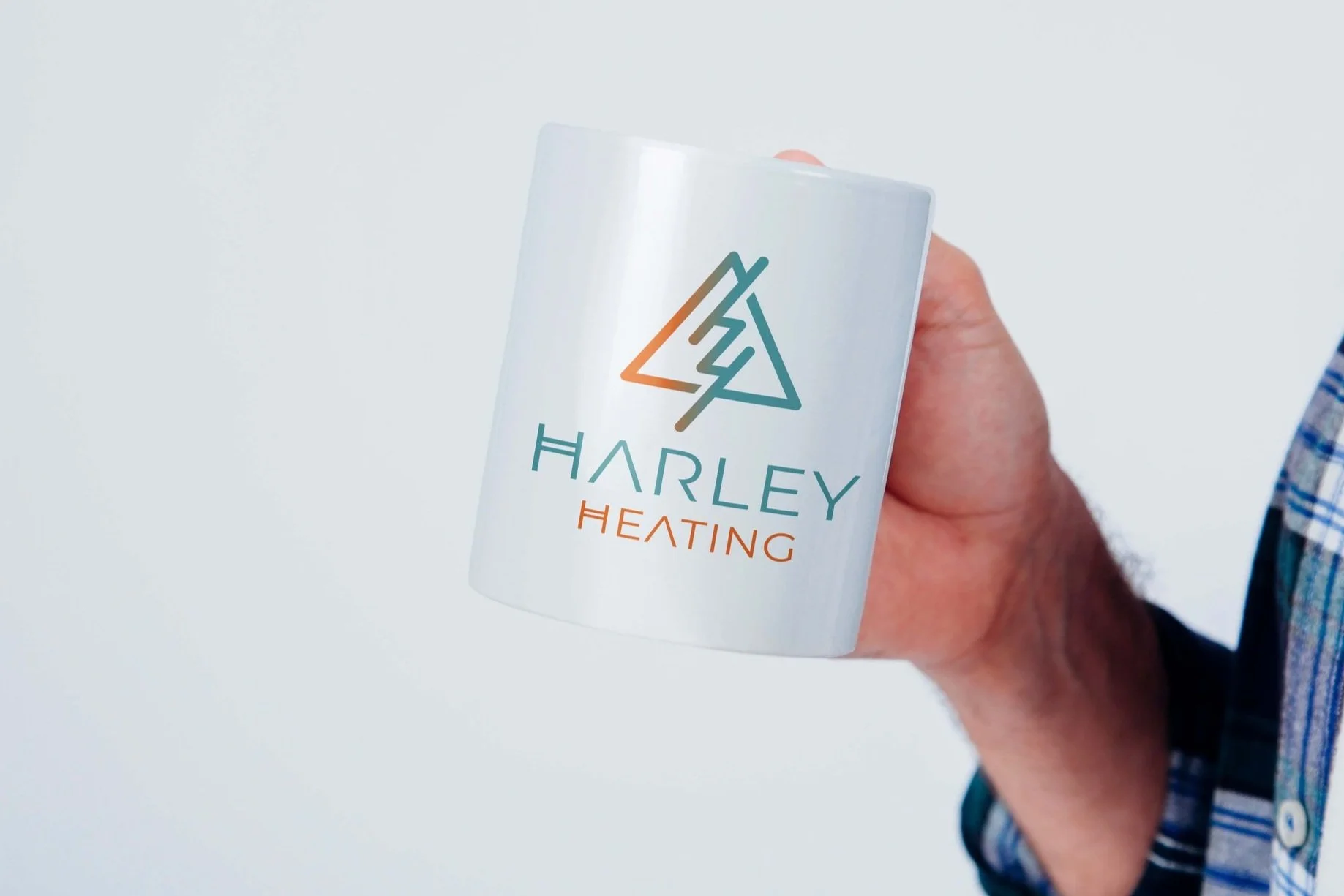
After some exploration a monogram logo style was developed featuring the initials “HH”. This was important step in the brand development as it signified that the founder was proudly standing behind the business with his name.
The logo shapes were created so that the letters flow into one another and are encased within triangle to echo the network of clients and also a network of pipes that are used within the industry.
To ensure that Harley Heating would get longevity with their branding we ensured that the typography could be placed on marketing materials successfully when without the logo monogram.
The colours fade from orange to green denoting our version of hot and cold - another explanation of the company’s purpose. These colours were chosen to work against a multitude of backgrounds from light to dark ensuring brand durability as the business grows.
WHAT THE CLIENT SAID
“As a small start-up business new to the art of design and branding we reached out to Luuuby Creative for some much-needed expert advice and guidance. Lorraine talked me through the design process step-by-step and together we found a design that is truly unique and represents our brand perfectly.
We wanted a logo that helped identify the business through the use of colour. As a heating business we decided on warm and cool colours to signify the element of temperature.
Lorraine also helped us build secondary logos to use on our social media, websites, business cards and uniforms. Finally, we used the primary logo as our focal point for our van livery and Lorraine designed graphics to suit our fleet of vehicles.
We would definitely recommend Luuuby Creative and look forward to working with them again.”
Living in the Edinburgh area and your heating system is giving you a frosty reception? Visit Harley Heating to get from cold to cosy again.
Our discovery calls are 100% no obligation. Get in touch now to book your chat.
Inspired
We don’t use ‘copy and paste’ designs. Our focus is to thoroughly research your business to ensure that we create a design that reflects your specific needs.
We always work to understand the little details, and incorporate these into designs as unique as your business.